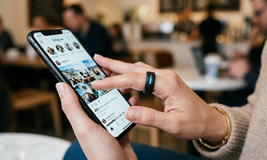
A ring that helps create healthy distance between you and your phone. Our attention is being exploited; being conscious of our use helps us fight against that.
Gather
Before any making, the partnership was defined. Six levers shaped how AI would operate in this project: not as a generator, but as a configured collaborator.
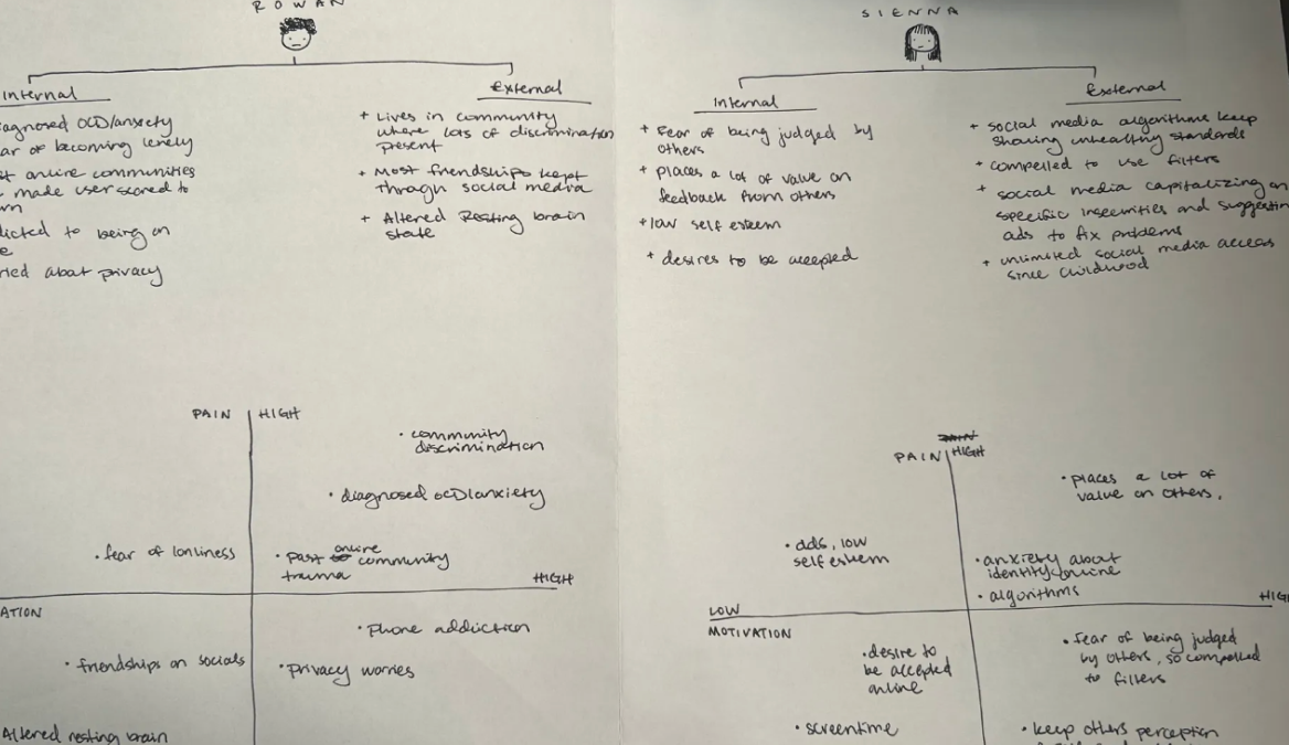
A similar minded person to Sienna but who is a bit more curious about exploration.
Ask me questions about form that connect back to my frame and also help me if ideas get too complicated or multi-layered. Help narrow down ideas.
Push me when I keep reiterating similar ideas or if it is clear I am getting stuck. Step back if I clearly have a direction I want to go and don't always suggest other routes.
Don't over explain answers or give me too many options at once. Also provide some background research/context for answers that require it.
Never generate ideas before asking what I've tried. Also don't generate ideas that are completely in a different direction to what I'm saying.
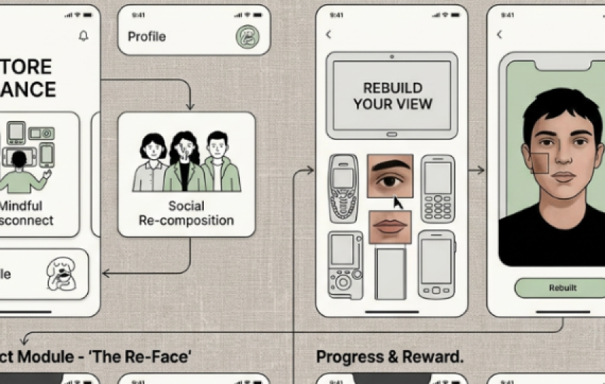
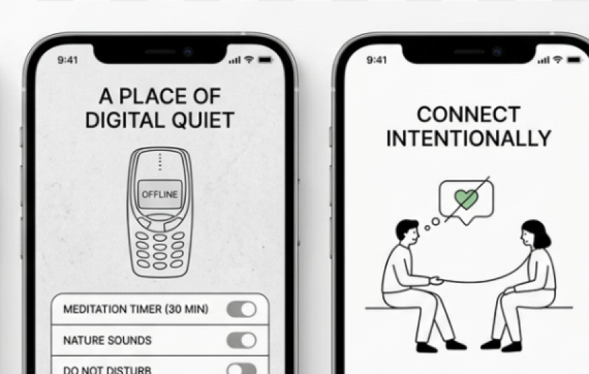
Create some sort of product, system, or app that captures the "quietness" of social media through healthy UX redesign, to support Sienna and bridge the gap between mental health and self-perception online.
Your prompt
"What do you understand about my project? Which parts still need improvement?"
Claude
"One thing I want to understand better before we go further: when you say 'quiet app,' are you imagining a redesign of an existing platform, or a new standalone thing Sienna would actually migrate to?"
What it changed
I began to think more critically about the definition of "quiet." It made me realize that I was stuck between making an app or a complete redesign of a system, which I didn't know how to show.
What was the question underneath your question? What made this worth a full quarter?
Self-perception: what that looks like on social media and phones, and how it can cause immense anxiety and obsession.
Unhealthy phone attachment, hyper-fixation on online identity, lots of time spent on phone.
I am interested in the idea of others perceiving us as it shows up in our dreams and nightmares because I want to understand how the unconscious reflects our perception of ourselves. (It soon shifted from dreams and nightmares to online; this was just my baseline.)
Explore
Three sources shaped the direction. For each, AI helped surface what the source held beyond its surface argument.
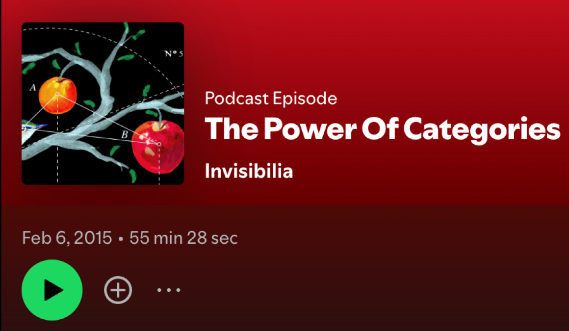
Podcast
The Power of Categories — Invisibilia
How the categories we adopt, consciously and not, that shape identity and behavior. The "prison of categories" becomes literal when algorithms freeze us into archetypes.
Article
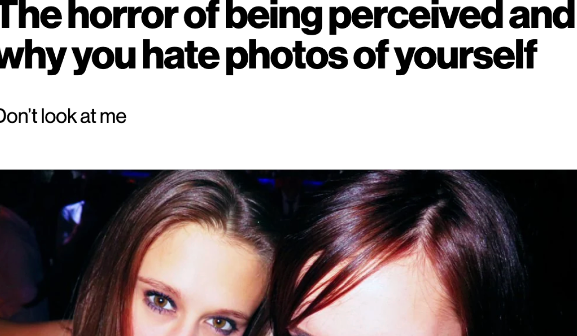
The horror of being perceived — Dazed Magazine
The discomfort of candid photographs and the "burner account" behavior they produce. The mirror gives us control; the camera removes it.
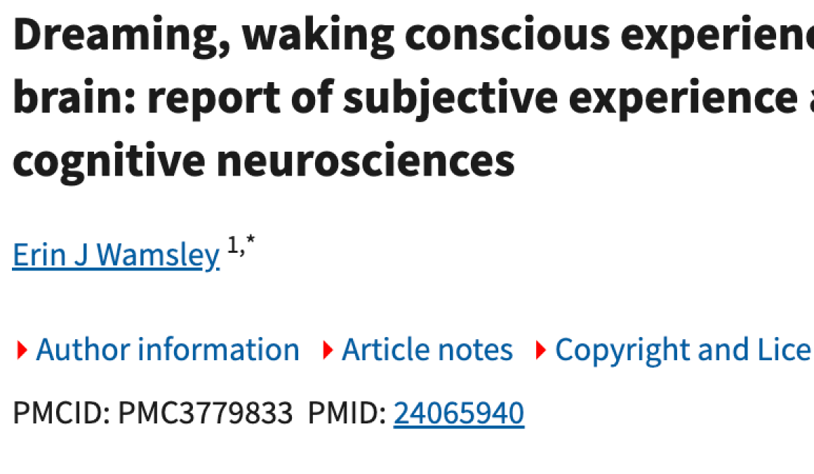
Research Article
Dreaming, waking conscious experience, and the resting brain — PubMed
How the resting brain processes external perception through dreams. The subconscious works to reconcile our internal frame with the image others hold of us.
Using NotebookLM to run these sources together revealed a pattern none of them named individually: the "permanent gaze" of the internet creates a structural anxiety because it denies us the privacy of a shifting, unrecorded identity. We want to be "gone" not from the world, but from the archive.
What it revealed
My project needs to be more holistic: it can circle around brain structures and their interactions but not directly address them. The more important question became: why is perception of ourselves important in general, and how do you create something that forces people to confront that?
Narrow
There is an opportunity to shift Sienna from addictive behavior and low self-esteem to a healthy state of self by addressing her social media use. Through educating her on meta-cognitive processes, reflecting on her behavior, and concepts of control, we can start to uncover how perception of ourselves correlates to digital spaces.
To what extent do digital environments warp perceptions of ourselves internally and externally, and what happens when we lose control of that process?
How does social media encourage negative perceptions of ourselves?
Is the "horror of being perceived" a universal phenomenon worth addressing at scale? And has this historically been a problem uncovered by social media?
Your prompt, from when you were still focused on an app
"What is my app's biggest problem or redundancy?"
Claude
"You say the app has no addictive features, but Sienna's success condition is still a 'daily dopamine hit' and 'check-ins.' If the app resets daily and limits interaction, what's actually motivating her to open it tomorrow, and does that motivation quietly reintroduce the same loop you're trying to break?"
What it opened
I realized that an app will not accomplish my goal. This was probably the biggest breakthrough moment for me. I completely pivoted to a tangible item rather than a digital one.
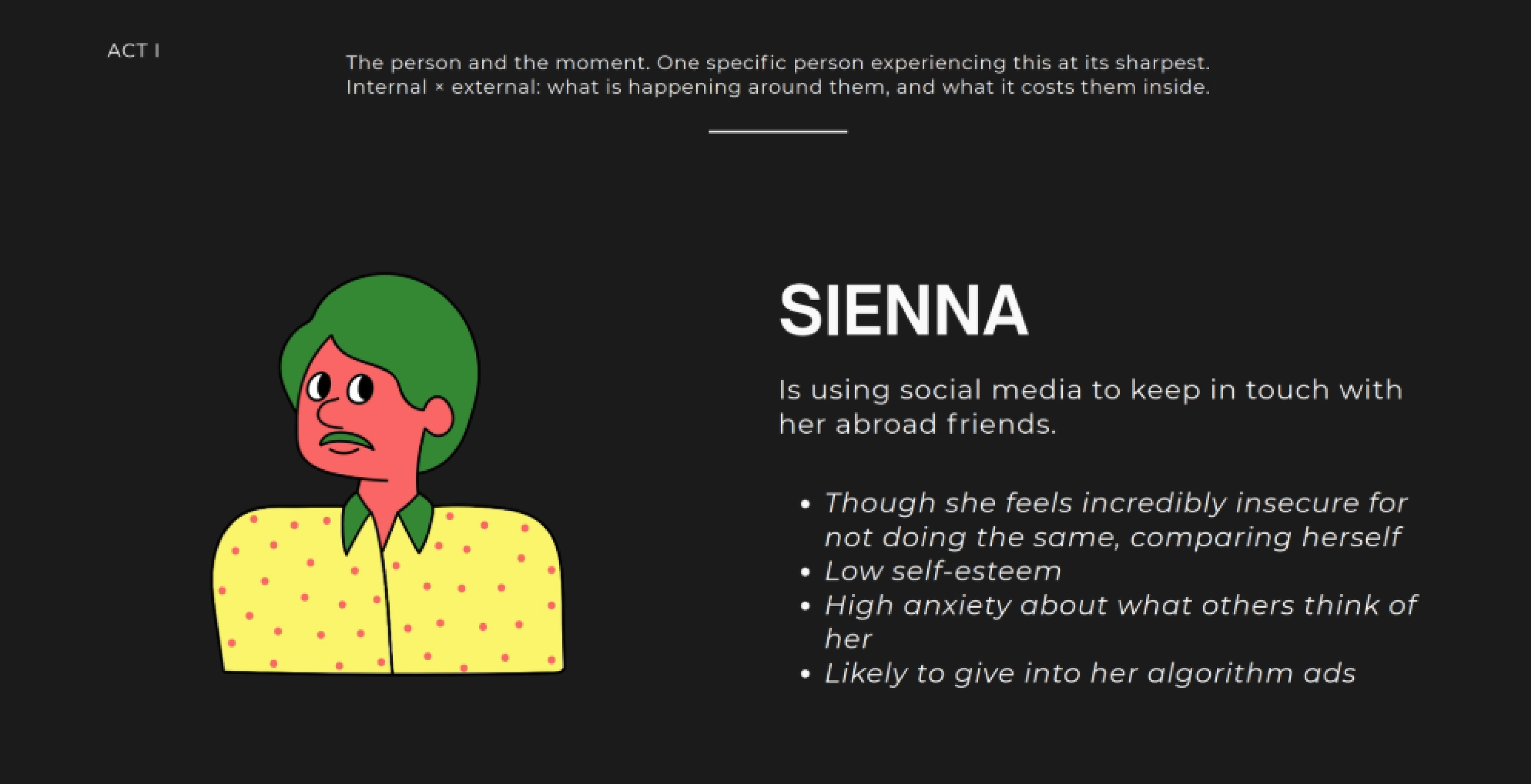
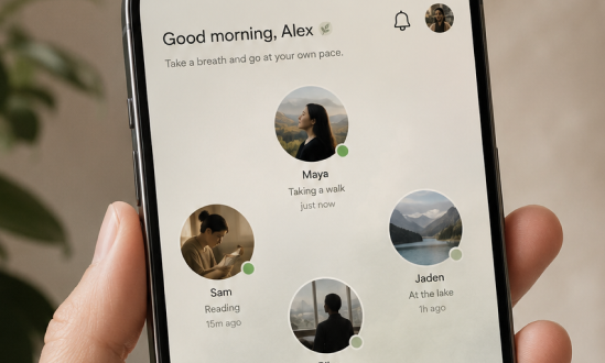
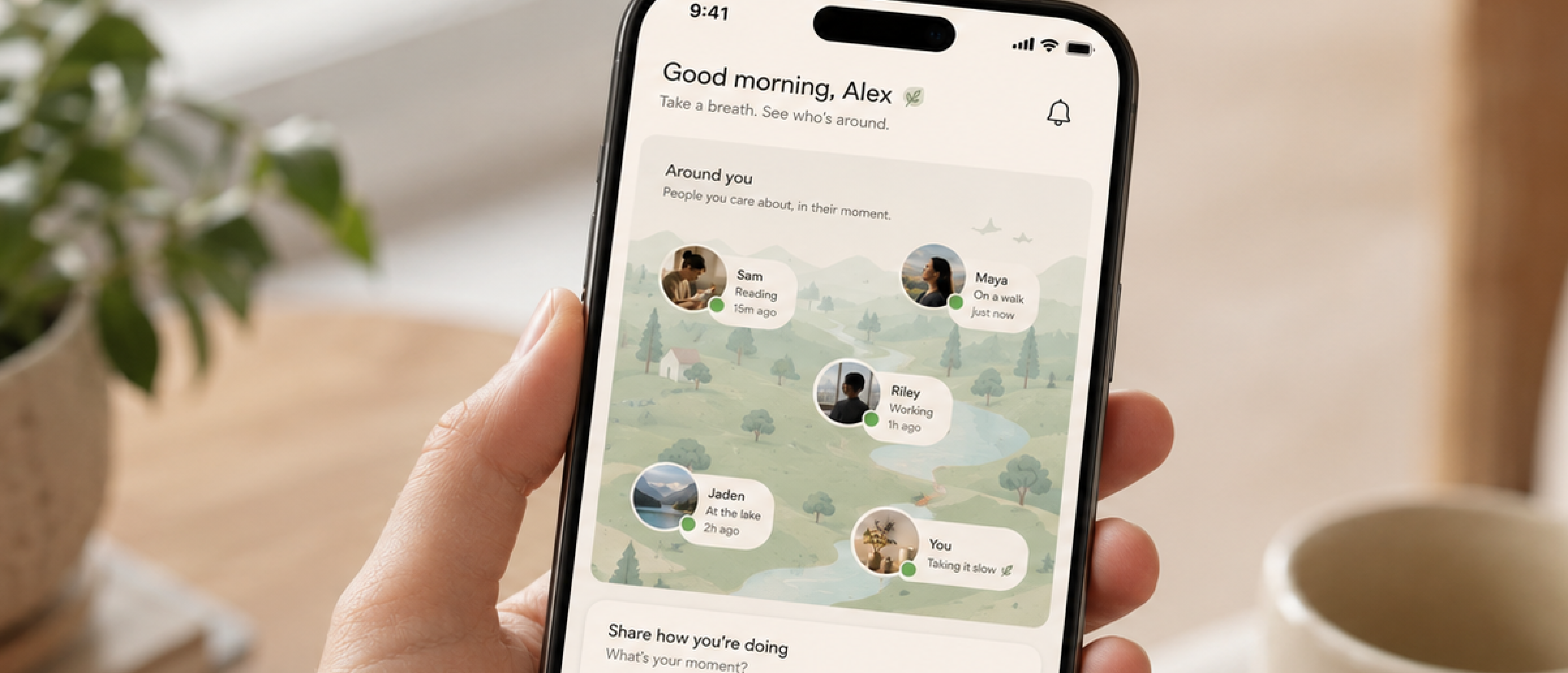
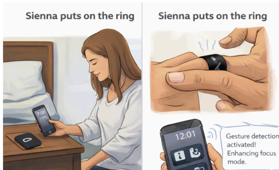
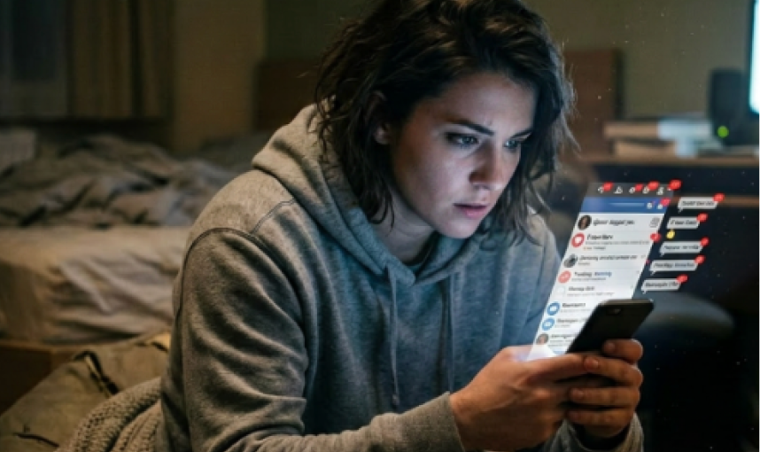
Sienna has an unhealthy relationship with her phone that has negatively influenced her self esteem, to the point where she scrolls in bed at night obsessing over how her online persona is perceived in comparison to others. She is scrolling to the point that critical responsibilities like catching the bus to work are overshadowed by phone activity. It is in this moment she has realized her reliance is obsessive.
Midterm reflection
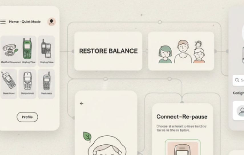
After presenting, feedback centered on two things: defining "quiet," and determining if I'm making an app or a UX redesign, because they are not synonymous.
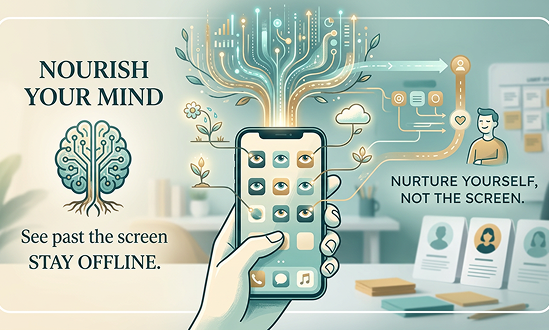
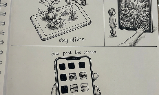
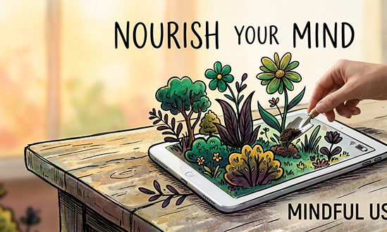
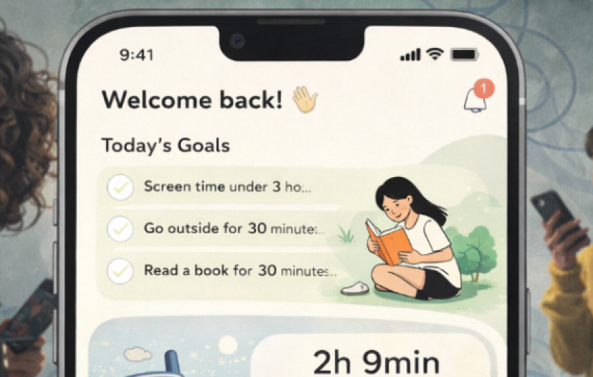
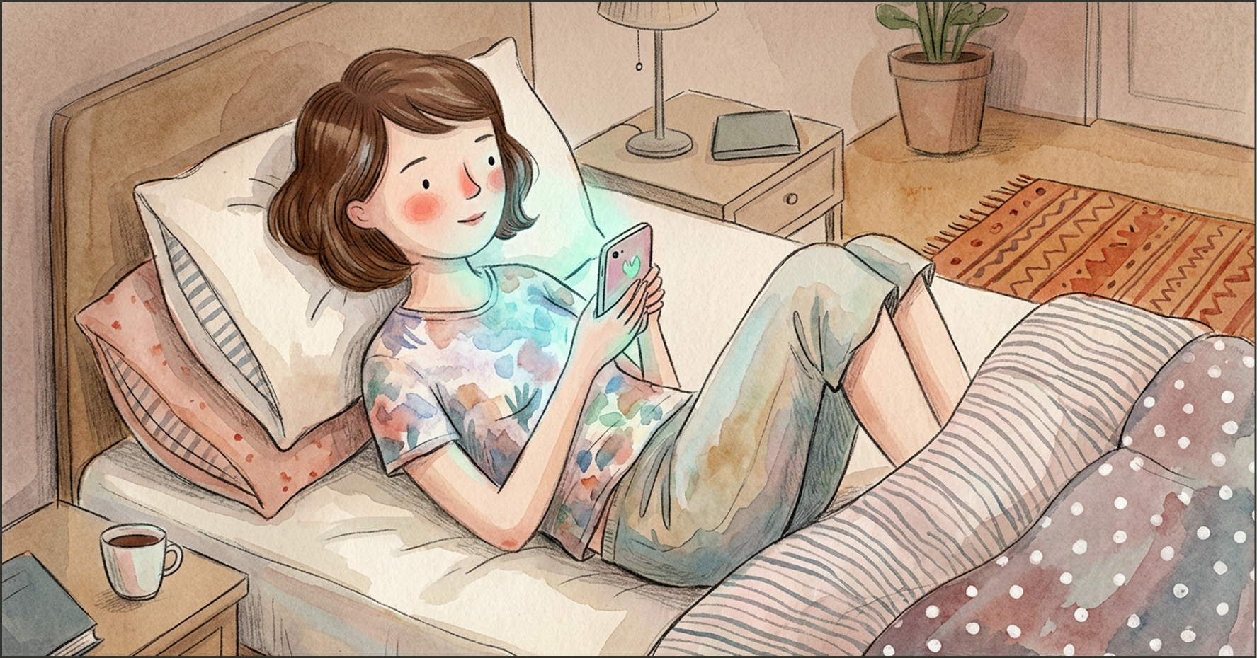
I reach for my phone in the morning as if it were part of my body and check social media like it's second nature. I rewatch my own Instagram stories, filter through my TikTok drafts, read the news — but I never consider the consequences because, to an extent, I need to be ignorant of it. To minimize harmful effects of digital spaces on our perception of ourselves, I want to bridge the gap between self-control and healthy UX interaction. To do this, I want to build a "quiet" app that allows for non-judgement and exploration of the self without feeling like you are on display.
Implement
The first making move, before the loop tightened. Generate to understand, not to finish.
What the making showed
It showed me what I had in mind with the app: something simple, a little bland, with features of self-monitoring. What was uncomfortable was sitting with the idea of just a non-engaging app. That simply isn't something that is going to work. This was the moment I started realizing that.
Convergence
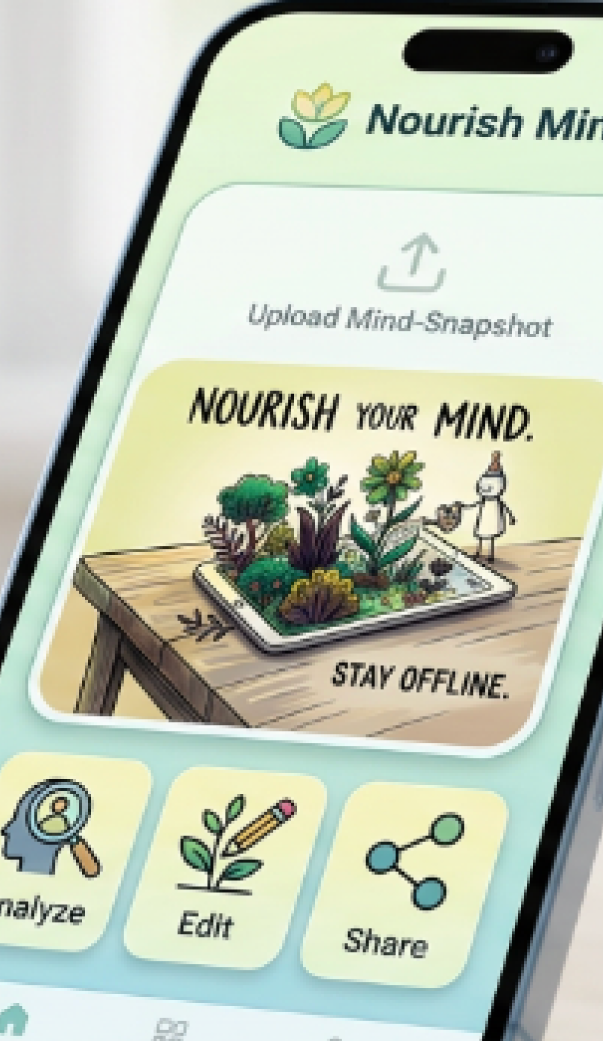
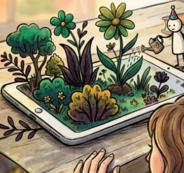
Instead of strictly social media functions, my favorite parts of the ideation were the small game-like elements. The concepts of "mind gardens," "mind palaces," "mindscapes" caught my attention. The tone shifted more than the concept.
Generating these very basic images of a ring helped lay the foundation for a new concept. The rendered images gave a baseline, and then I began to blend my original goal into the new one.
Before
Sienna before the intervention: the state, the gap, the thing that has no form yet.

After
Sienna after engaging with the intervention: what is now present, what is different.
Three versions. Each one sharpened the visual argument.
What I Learned
Generating these images of a ring helped me lay the foundation for a new concept and expand on it further. The rendered images gave a baseline, but nothing "special" about the ring. From there I began to blend my original goal into the new one.
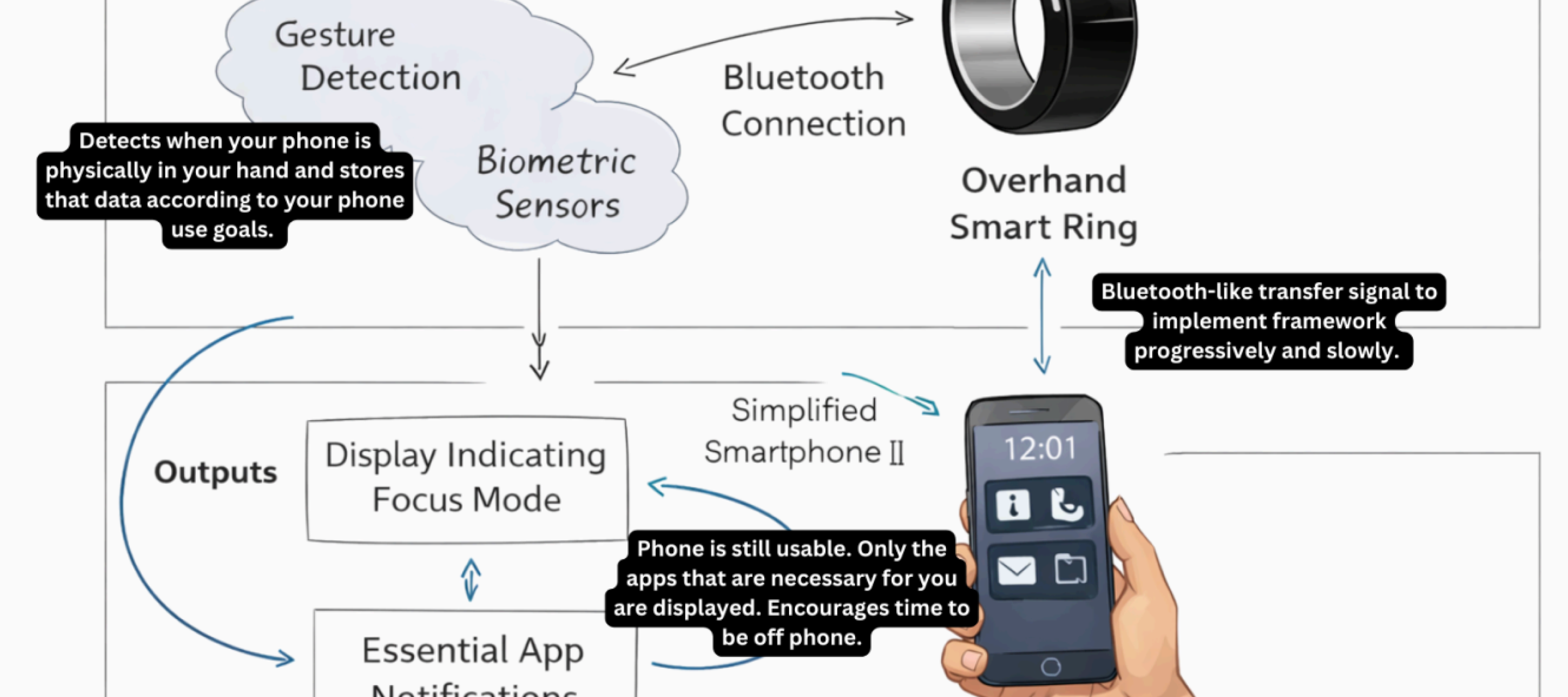
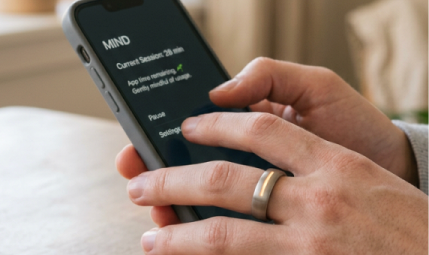
Gesture Detection + Biometric Sensors + Bluetooth → Overhand Smart Ring → Simplified Smartphone UX with Focus Mode. The mechanism is the hard part.
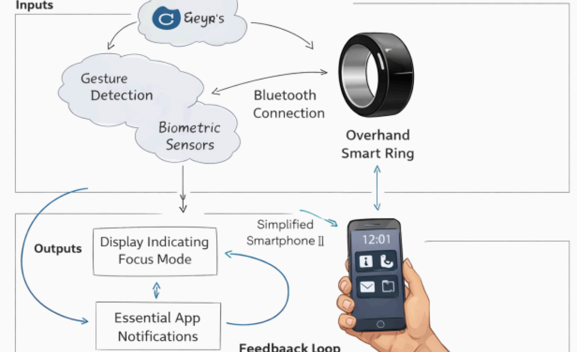
The second image (inputs and outputs) shows a relationship between sensory tech and focus that the others do not. However what is missing is the emotional and psychological relevance of the ring. Here it is simply systematic. It's missing why a ring is preferable to other tech and what the goal of a quiet UX design actually is.
The visual world every image must belong to. Not a style reference: a set of rules that every generation is measured against.
Strongest image from moodboard

Strongest image from moodboard
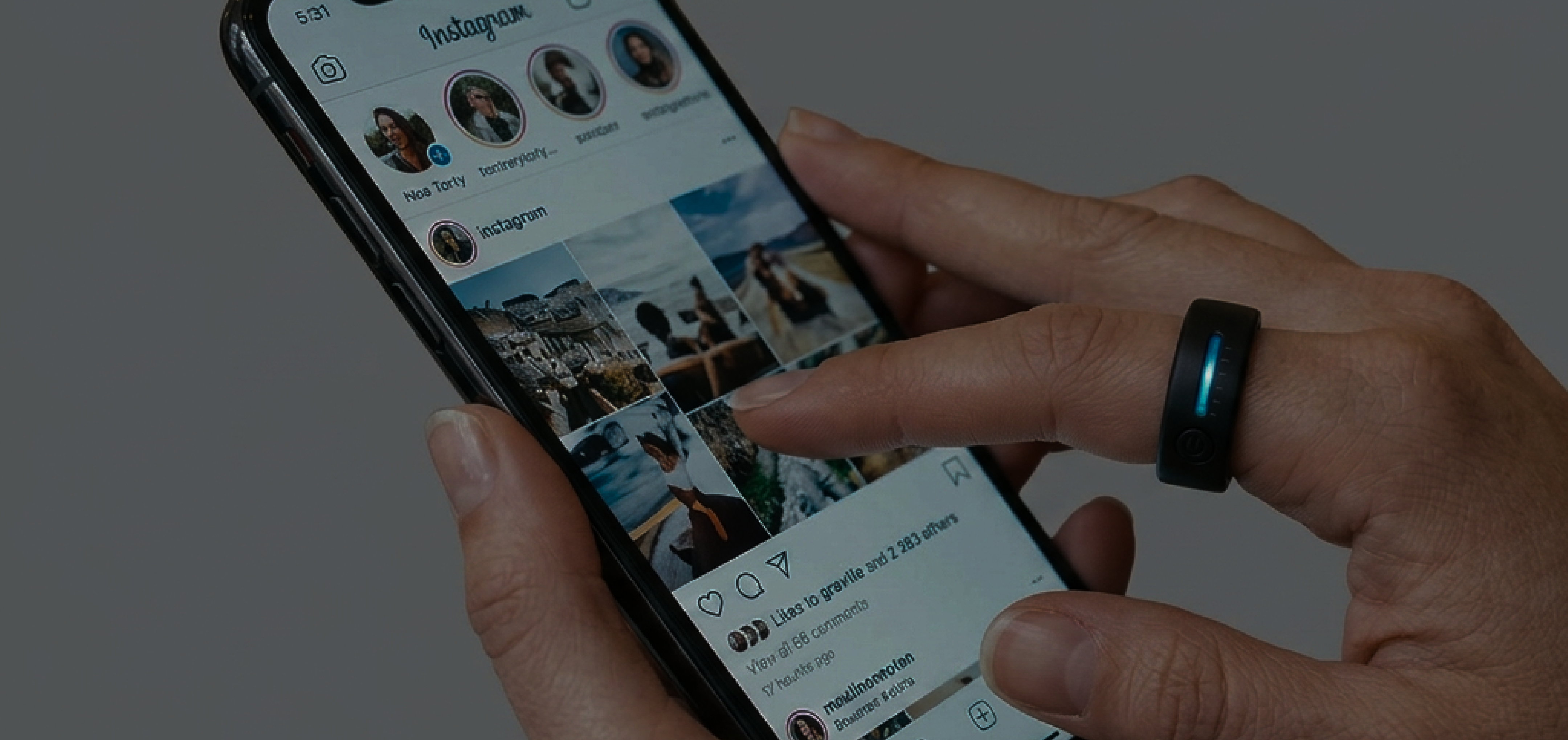
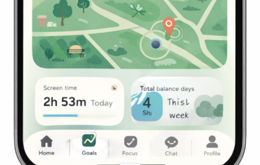
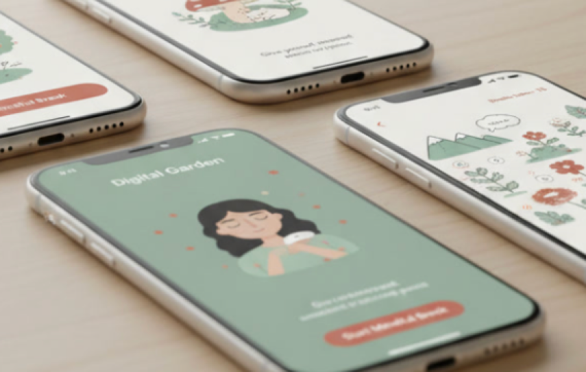
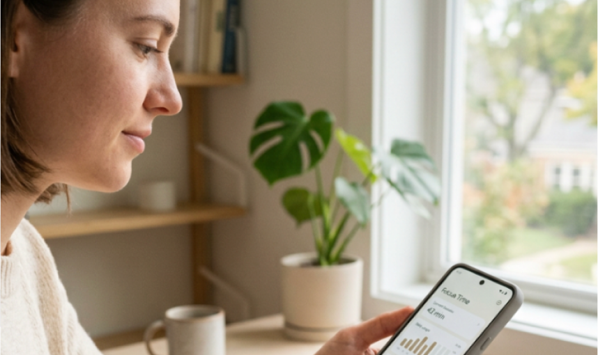
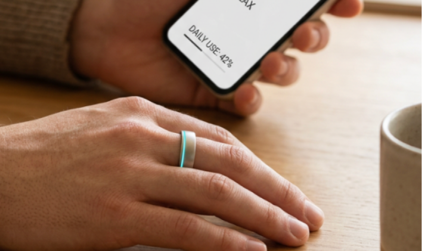
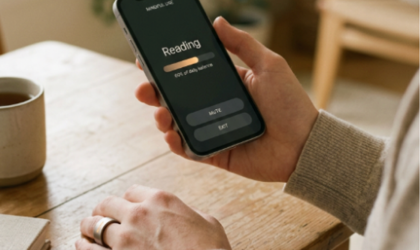
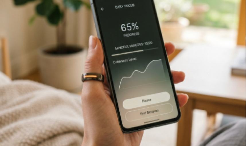
The world this project lives in is supposed to reflect a calm and tranquil atmosphere, contrasting to the overwhelming aspects of real life and online presence. The light is bright and warm while the space is minimal, quiet. The ring showcases a progress bar on somebody's hand while they are on their phone. Their phone should show a simplified version of its UX design stripped down to the essentials. The emotional register is familiar: the user shouldn't notice the ring unless they are on their phone, and even then, it gently reminds them when it is time to get off certain apps with a slight vibrating haptic. Never show data that is public or compared to others. It should also never show super high-tech surveillance. Metrics should only be for user reference. Everything in the frame: the ring, the user, a quiet environment, and a simplified phone.
This or That Exercise:
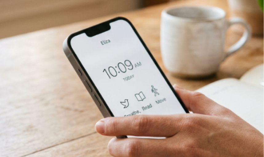
12 shots across four groups. What worked: shots 11 and 12 followed similar patterns; removing the environmental descriptors prioritized the product and held the tranquil mood regardless. What didn't: they are all variations of each other, bland, and don't show the full capabilities.


What changed
I decided to add an app feature to connect back to my original idea and add more dimensionality to the project. Simply a ring is not enough to tell the full story of "quiet" UX design.
Storytelling
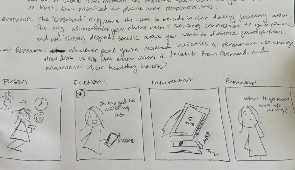
Four beats. Who Sienna is, the moment her phone wins, the ring entering the scene, and what remains after.
Sienna, 23. Struggles with anxiety, low self-esteem, and impulsive buying from algorithm ads. She hates that she has to use social media but it's one of the only ways to keep in contact with some of her friends.
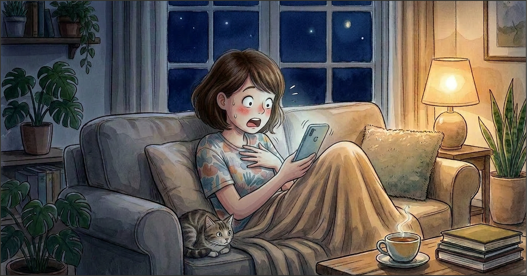
She's scrolling on her phone to the point that critical responsibilities (catching the bus to work) are overshadowed by phone activity. It's in this moment she's realized her reliance is obsessive.
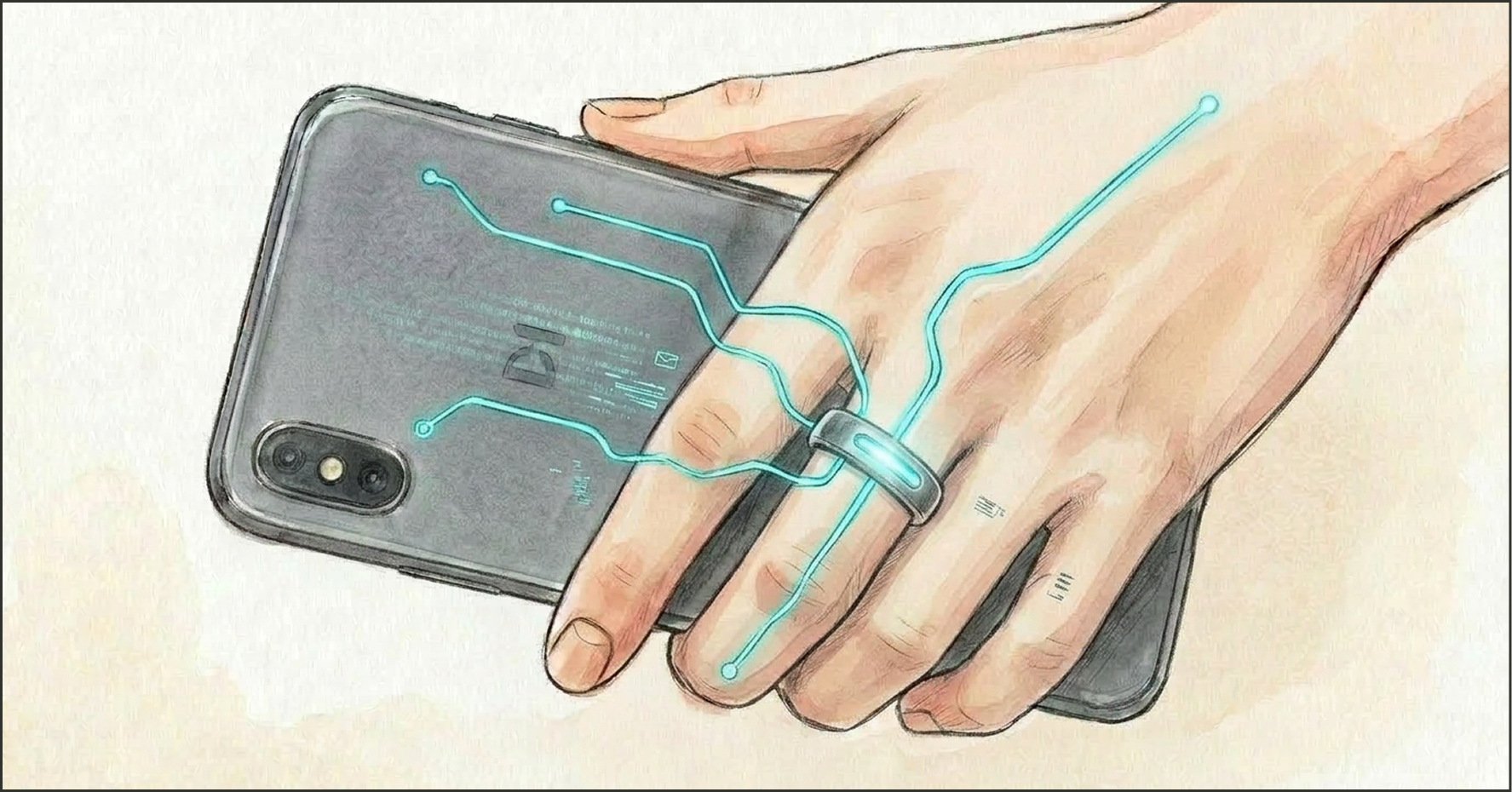
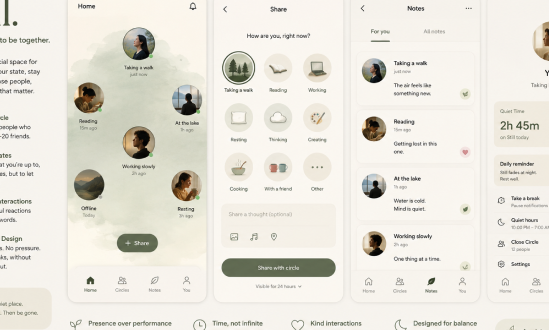
The ring enters quietly. It shows a progress bar only while she's on her phone. When it's time to step back, it vibrates: gentle, not punishing. It never shows her data compared to anyone else's.
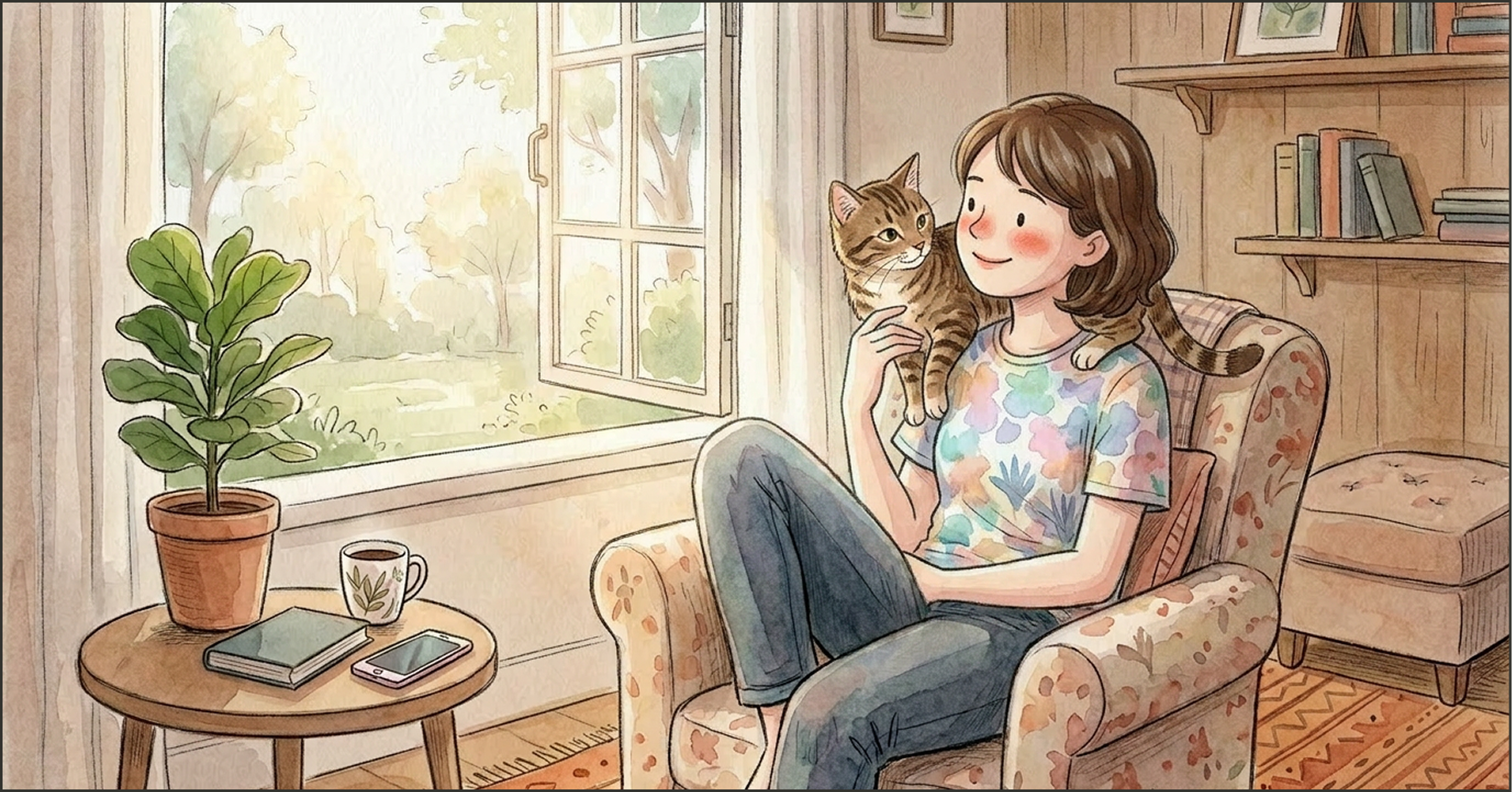
Sienna still has her phone. She still uses social media. But the relationship has shifted: she chooses it more than it chooses her. The quiet is hers now.
I want the viewer to leave feeling curious about the product, hopefully inspired to try it out. If not that, at the very least reflective about their own phone habits.
What the video taught me
Style and storytelling note: I want the viewer to leave feeling curious about the product, hopefully inspired to try it out. If not that, at the very least reflective about their own phone habits.
Evaluate
Using AI as a thinking partner was a lot more push-and-pull than I thought, and surprisingly a good tug-of-war dynamic. I used it as a stress tester rather than a creative companion to maintain more control over the originality of my project. It helped me see the invisible flaws in my process, which only furthered me to continuously improve it.
AI doesn't have to infiltrate your whole process. Instead it can work as a tool to push and pivot against.
Week 1: Before
I thought of AI as something that abstractly gathers data. ChatGPT seemed like a beast I didn't want to risk — my mom had always stressed cyber security. I was skeptical: if I used it for class I was cheating myself out of learning. It wasn't until my 3rd year of college where I started asking it questions I couldn't find on the internet.
Week 10: Now
Now, I know that how we engage with AI is mostly dependent on the person behind the screen. The way we talk, set, and adapt it can make or break the outcomes we want.
Class Gallery
A breadcrumb trail across the process. Not polished. Real. Every image here is a decision point.
Initial brainstorming: lots of ideas swimming around.
Shaping who the project is for — between Rowan and Sienna, who have different aspirations.
SWOT analysis, narrowing down the scope.
First idea for cover images — still when set on making an app.

12 ideas for how the "app" could show up for people.